Have you come to realize that default fonts in PowerPoint just don’t cut it?
Default fonts in PowerPoint
Super common fonts like Arial, Calibri, Verdana, Â just to name a few.
We’ve seen it hundreds ( to some thousands ) of times in PowerPoint presentations. These default Microsoft fonts have taken the presentation world by storm due to it’s safe traits. I mean, you can’t go wrong with Arial can you?
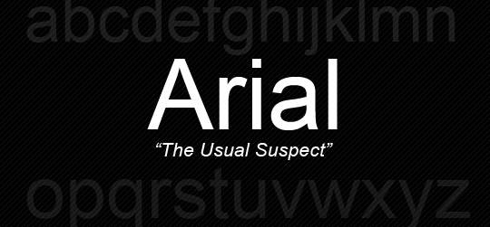
The Well-Known Arial
Default Fonts Are too common and overused
You can go too often though. Default fonts lack a certain pizazz that the audience love and resonate towards; It’s not that they are bad, they are just hopelessly overused. It makes your presentation work harder to stand out and brings nothing new to the table. Typographers have put years into developing aesthetically pleasing typefaces, and we as humans have been using words for centuries. It is important in design as well as in presentations. Show the audience that you put effort into making your PowerPoint presentation visually pleasing and functional to have a more memorable presentation as a result.
I don’t mean using Comic Sans or Papyrus of course. I mean, these typefaces have websites dedicated against their usage.
Comic Sans Criminal

Use any other font besides this.
Papyrus Watch
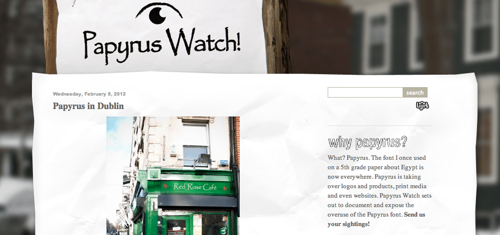
Watch out for Papyrus!
Better Fonts for PowerPoint
You do not have to be a designer to use better typefaces or create presentations that are more functional. Here’s some advice on how you can use better typefaces in your PowerPoint presentations:
1. Download New Fonts
There are literally Millions* of fonts available on the internet and most of them are Free for personal use and some for Commercial use. Start building a small library of different kinds of fonts that you can start to utilize for your next PowerPoint presentation.

3 Different Types of Fonts
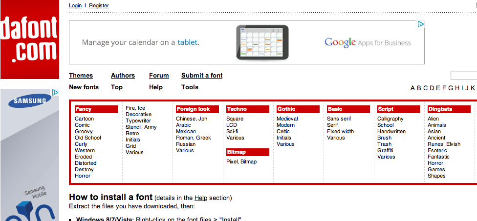
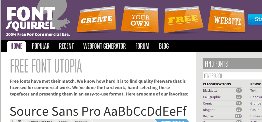
Some websites that offer great fonts for Free are Dafont , FontSquirrel and Fonts101. ( I frequent these myself )
[zilla_toggle title=”DaFont” state=”closed”]
Huge Library of Free Fonts
[/zilla_toggle]
[zilla_toggle title=”Font Squirrel” state=”closed”]
Font Squirrel, Free Commercial Fonts
[/zilla_toggle]
[zilla_toggle title=”Fonts101″ state=”closed”]

Free Fonts Galore!
[/zilla_toggle]
2. Pair Fonts Together to Invoke Desired Emotion
After you find some amazing fonts, it’s time to mix-and-match a few together to create a great pairing.
There’s a great guide by web design tuts but i’ll just give some common examples.
Each font has it’s own personality, thicker fonts are ‘louder’ and more ‘in-your-face’ as compared to thinner fonts that are more sleek and polished. Some fonts are more playful and some are more formal. So choose wisely to fit the occasion and emotion you want to invoke.
You can try different weights of fonts of the same type:
[zilla_toggle title=”Sans Serifs Combo” state=”closed”]

Neutra Display and Bariol
[/zilla_toggle]
You can mix different types of fonts:
[zilla_toggle title=”Sans Serif & Serif” state=”closed”]

[/zilla_toggle]
[zilla_toggle title=”Sans-Script” state=”closed”]

[/zilla_toggle]
3.Use Typefaces Sparingly

Lobster has been used a lot recently
Remember how I mentioned that default fonts got a bad rep because they are too overused by inexperienced people in the wrong way. If you don’t want your new typeface to face a similar fate, use it sparingly. To be consistent in presentations, keep to about 3 typefaces throughout the presentation.
4.Make It Subtle Yet Impactful

Well Executed Typo-Dominant Slide Example
Keep in mind that in most presentations, the audience may not be sitting near to the screen, so always keep your typefaces Big and Clear so everyone can see what you’re trying to bring across. ( Regardless whether it’s paired with an image or not ) It also helps you to keep your content succinct as keeping your fonts huge also ensure that your PowerPoint becomes less cluttered. Do remember to leave whitespace at the sides for visual breathing room! Overall, a well-executed typo-dominant slide should come across to the laymen as visually pleasing yet very simple to accomplish.
Have you been using effective fonts in your PowerPoint Presentations?